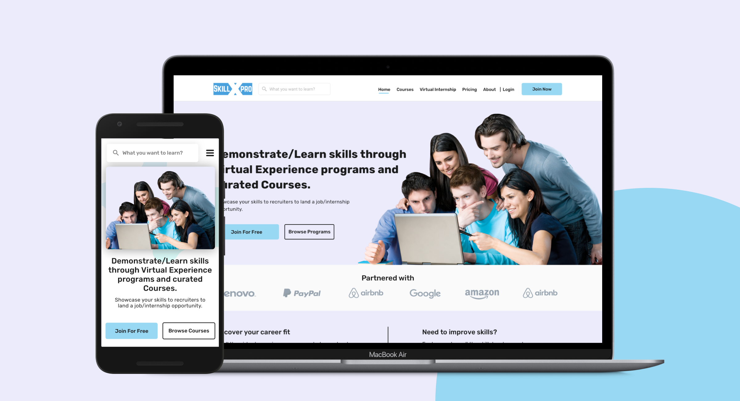
SkillxPro is an online skill development platform for people who wants to improve their skills and help them land the jobs they want to aspire for.
Timeline
Nov 2019 - Jun 2021
Tools
Sketch, Pen & Paper, Zeplin
My Role
Product Designer
Responsibility
User Research, Wireframing, low and high-fidelity Prototyping, Conducting Usability Studies, and Visual Design(UI).
Challenge
Our challenge was to revamp the SkillxPro website to be a seamless journey focusing on user flow. Also to create a PWA app for the same with time constraints.
Impact
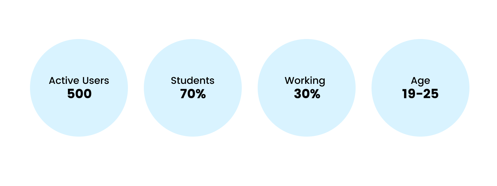
Increase in 20% active users after 1.5 months. The user engagement was better than before. We started getting feedback in the first week of launch. Users were happy with the new look. More than the new UI they were happy about the new experience throughout the website.
Research
User Research
Had an in-depth discussion to understand the Stakeholder’s vision. After the discussion, I went through all the reviews and feedback that they got from users. The reason for this was time constraints and I found it was the best way to find out what users wanted and their needs. I dug into the reviews and found some pain points and needs of the users.
My research also found that there was a 60% bounce rate on the website.
Pain Points
User Interface is not modern which makes the user sad.
Bad user flow making the whole experience bad.
User engagement was bad, users dropped off from courses.
Limited Courses - There was only one course at that time.
Goals
Improve the overall experience for users from buying a course to finishing a course.
To increase user engagement.
Making courses more enjoyable and encouraging users to finish courses.
Transparency about the course by adding more info about the course.
Making the experience consistent for both web and mobile.
Constraint
Quick launch - Less than 4 months. I was the only designer.
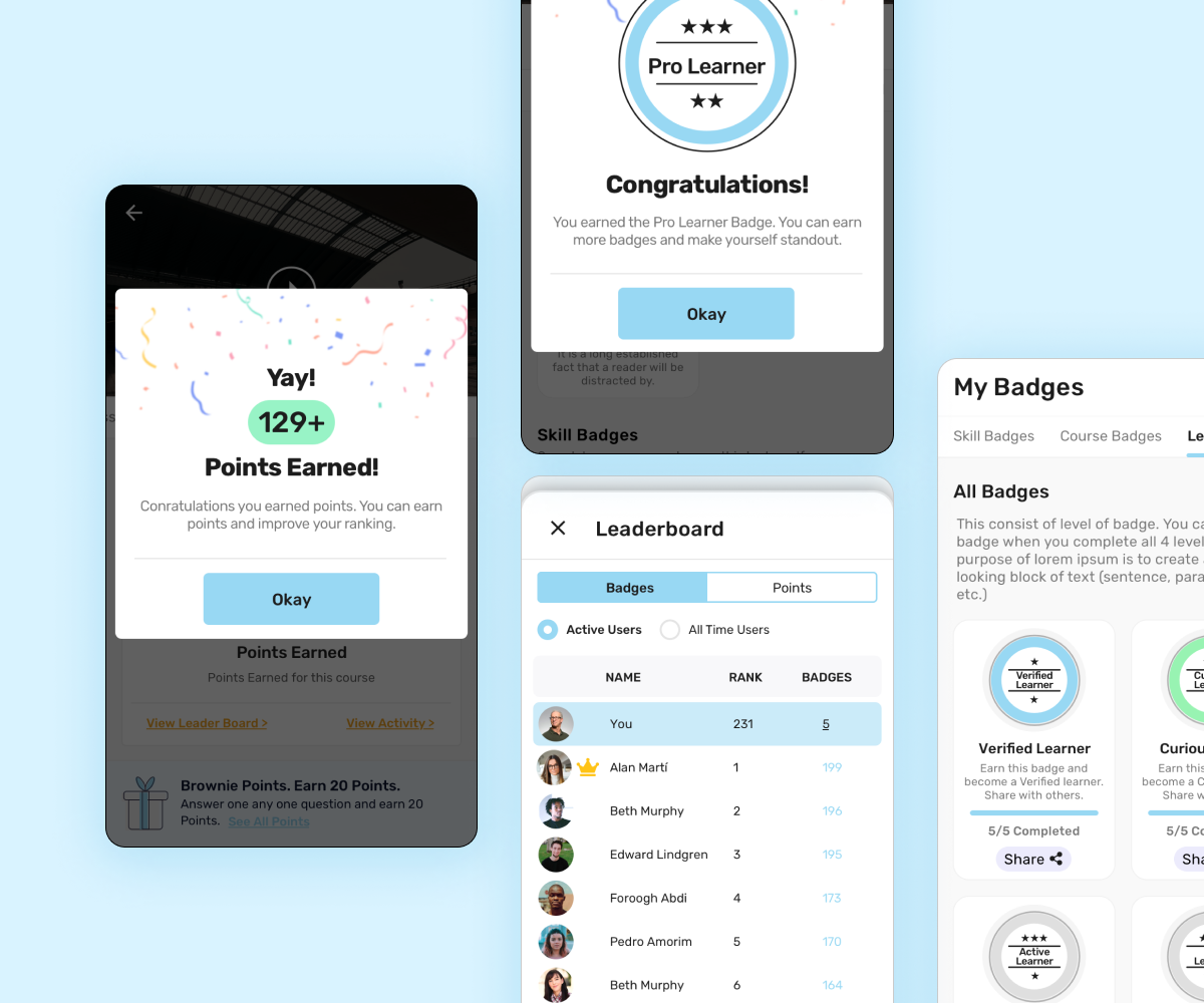
Gamification
We introduced Gamification. This was the big step in making it more appealing & engaging. We added a Leaderboard, Points, and Badges features to make it enjoyable, fun, and fun competition to increase user engagement. We wanted it to be fun and not pressure them to earn more points, so we made earning points much easier, like completing the user profile. Unlocking Badges is also easy so it encourages the user to complete the course as fast as possible.
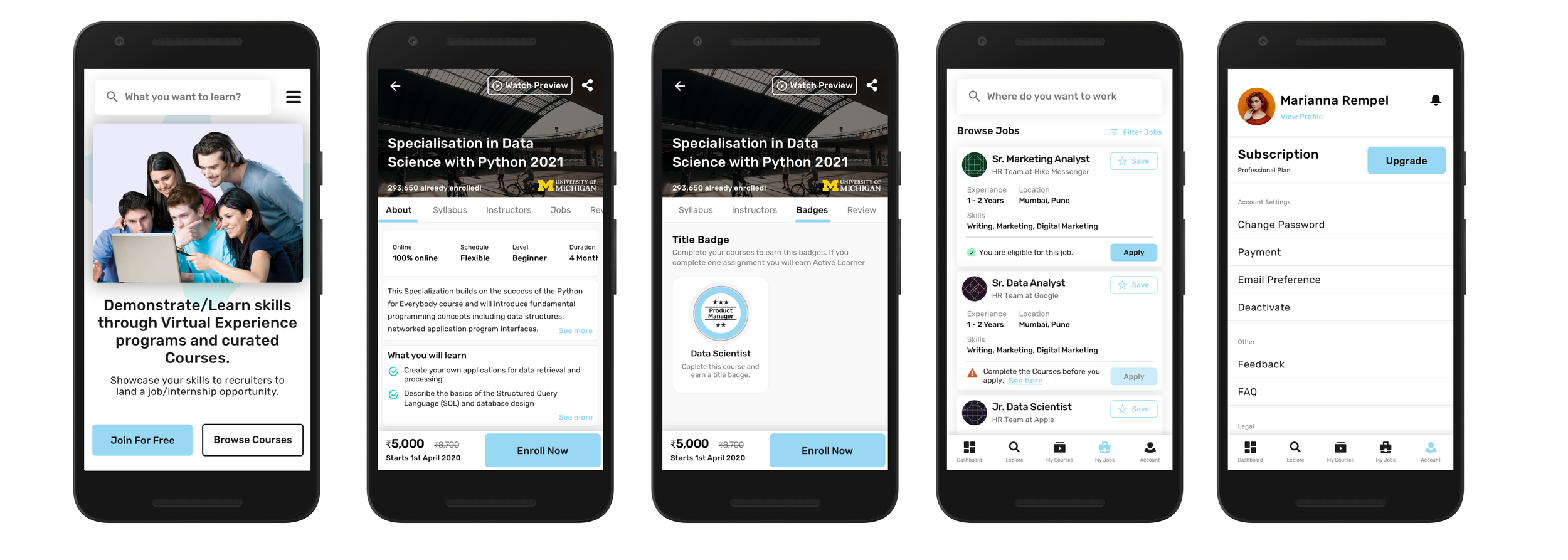
Badges - Badges can be earned after you complete a course. Badges are based on Courses and Skills within that course. So basically you earn Skill Badges and a badge for completing a course.
Points - Users can earn points based on what they do. For example, If they complete the profile they earn 10 points. They can earn points for completing a certain amount of courses or a certain amount of videos.
Leaderboard - The leaderboard would show their rankings where they stand among other students. This will encourage them to be more competitive.
User Flow
I decided to design and own the user flow for the app to see how the user will go on booking a consultation. I wanted to remove the unnecessary thing that could potentially slow down the booking process.
To make things less complex I broke the user flow into parts. First I worked on the Course flow as it was the main part of the product and then I worked on the other small products like Job, and Virtual internship.
Paper Wireframes
I started with paper wireframes sketching out the booking flow. This gave me the opportunity to try different ideas. But it had to be a quick due to time constraint.
Prototype, Testing & Iterations
Turned my wireframes into a quick Digital prototype. The main goal of this prototype was to test the flow of a user that browse the courses and then go purchasing that course or subscribes to SkillxPro Plans. In this testing, we wanted to see if we could find any gaps that we can fix early in the design process.
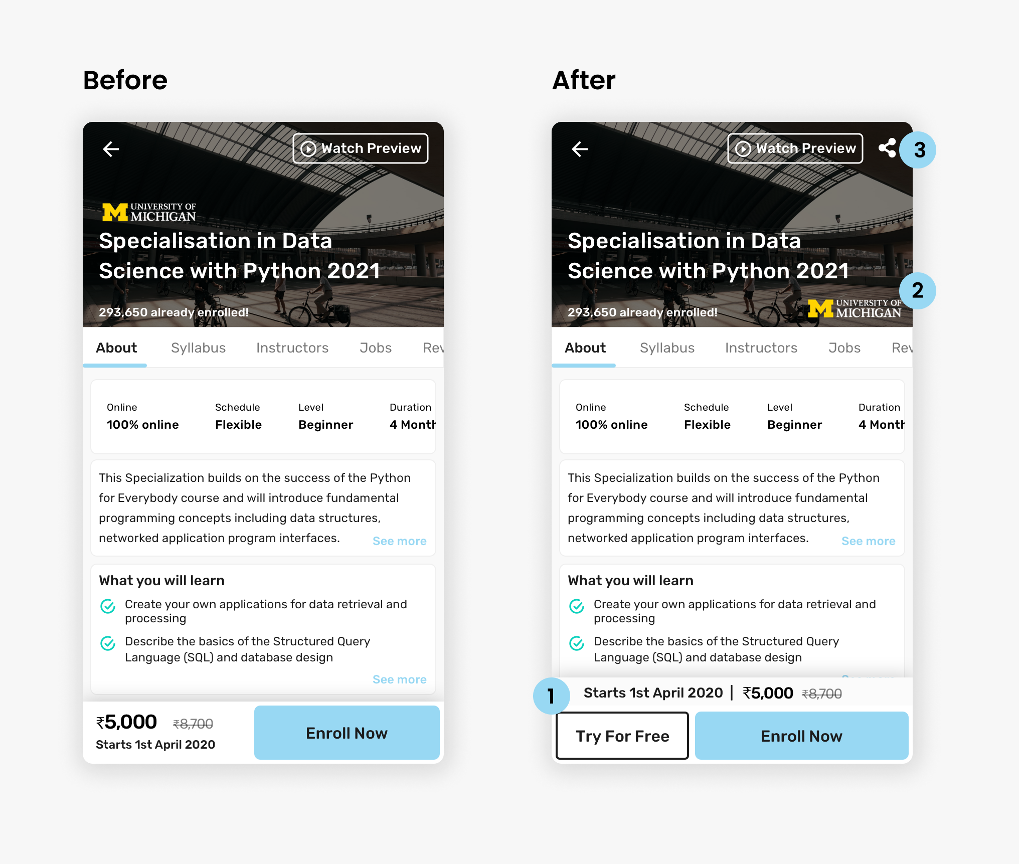
Course Description Page
Added a “Try for Free” Button. As we were going to give new users a trial. This was added to encourage users to sign up for free and try this course.
Moved the logo from top to right bottom so that we can have even large Titles/Headings without compromising the height of the hero section.
The share button was missing. We wanted users to share the course on social media. This was for increasing sales.
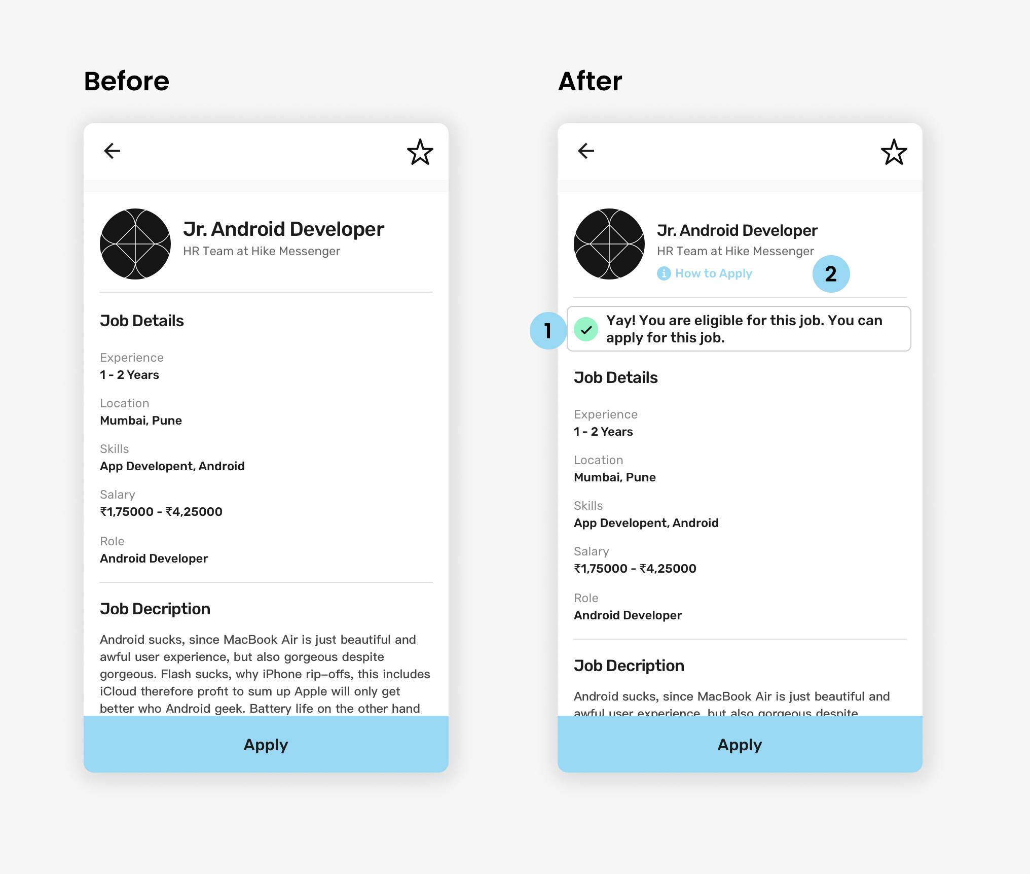
Job Description Page
The user should no if he is eligible for the job post he is browsing before he can apply. This reduces the
Context: Jobs can be applied by the students who complete a course on the SkillxPro platform.
A descriptive way of educating users on how they can apply for a job. It is on the same page as it reduces the number of times a user has to navigate through the app to find the FAQ.
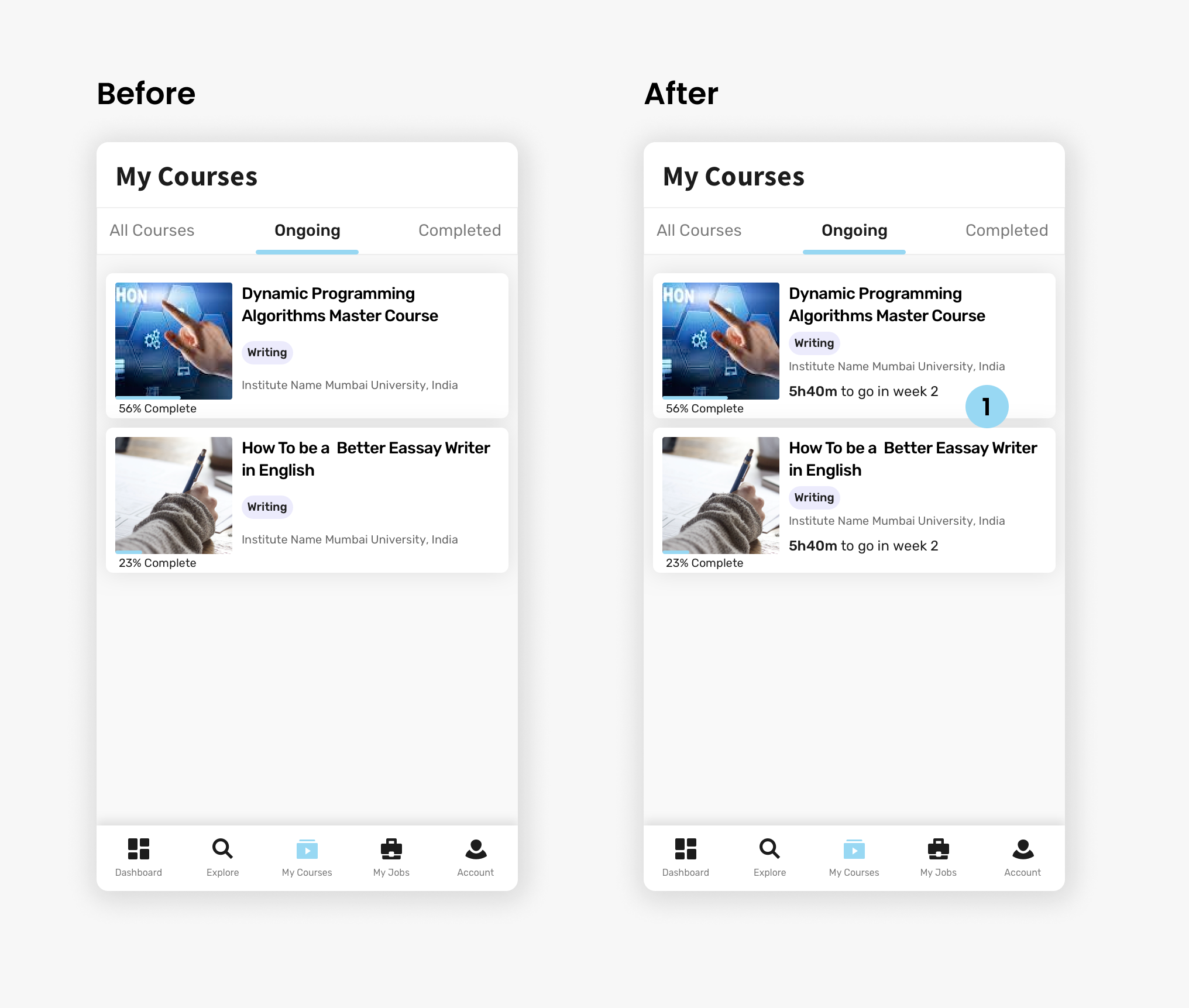
My Courses
Showing users the time remaining to complete the course for that week.
Why Week?
Showing an overall time to complete will overwhelm the user as it will show a bigger time frame (20hr for 4 weeks), instead, I chose to show a week which will show the user a short time frame to complete(5hr for 1 week) which is also an achievable goal.
It is easy for users to just concentrate and break a course into weeks and complete the course without stress.
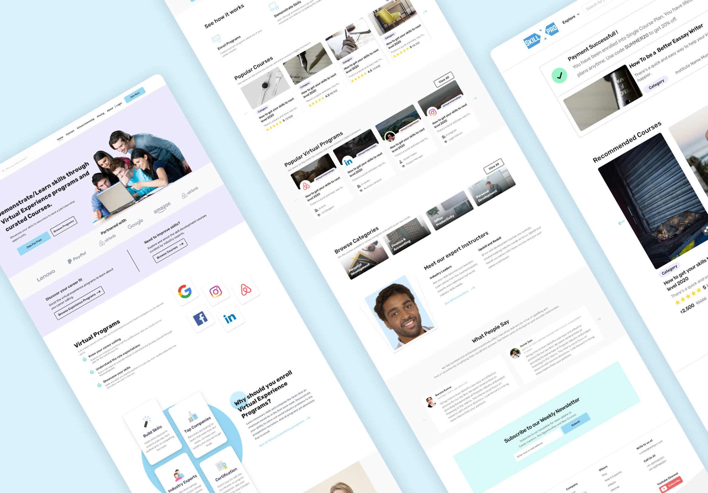
Final Design
UI Design for the PWA app and Website
Courses - PWA Designs
Wesbite - Landing Page

Recruiter Dashboard - Website and PWA
Students Dashboard & PWA
Takeaways
The best thing about this project was that I worked on the Gamification feature which gave me a perspective on how you can make Ed-Tech a fun platform.